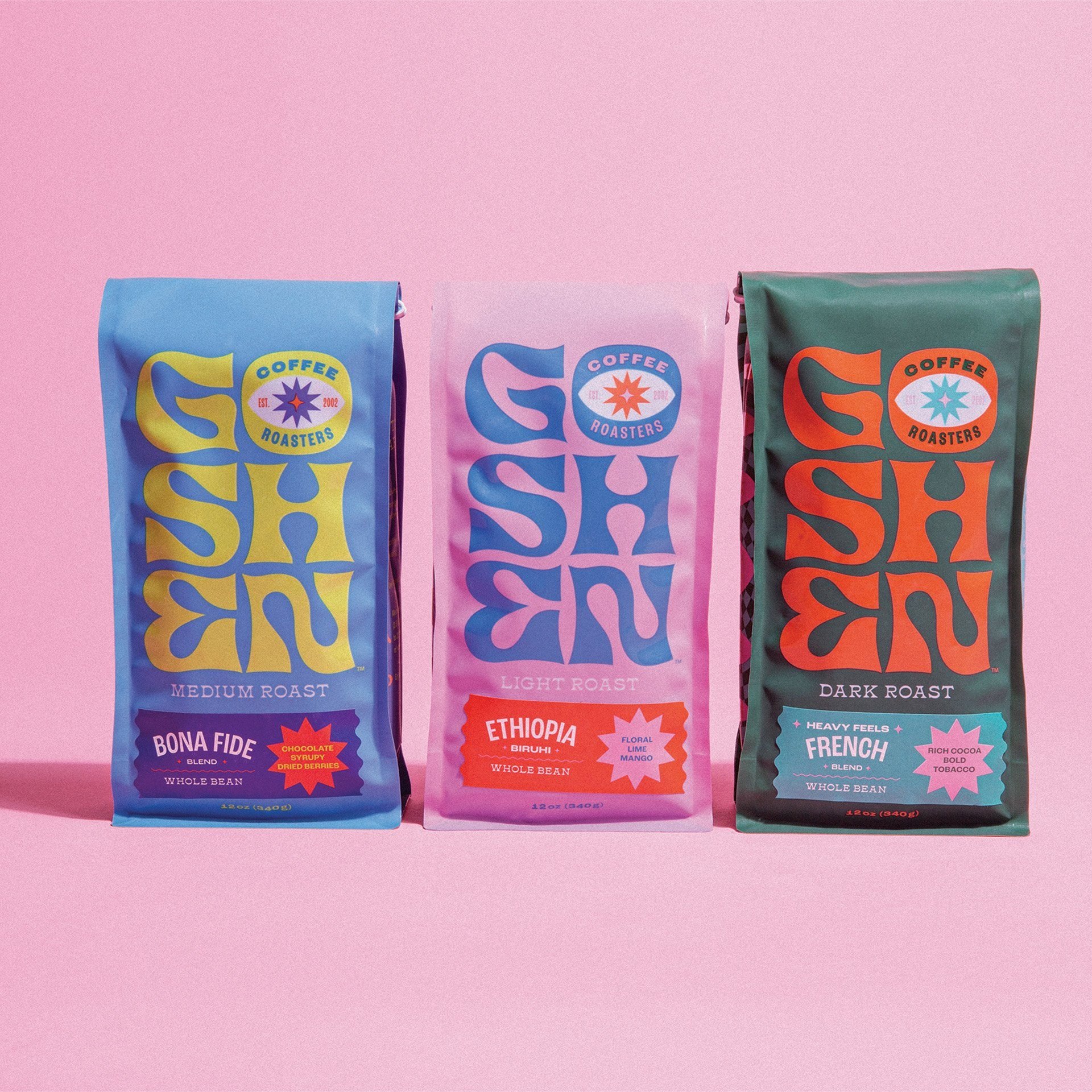
A look at design trends for 2024
With a new year, it’s always fun to reflect, but also to look ahead at what’s coming. Trends are something on which we tread lightly around here, but it is vital to look at what the larger industry is doing as a whole. While adding gradients to your box design may be so 2022, adding video to your product page may be just the ticket.
Here are a few fun things we see rising this year!
01. Sustainability at the forefront
Consumers are very connected to how their purchases affect the world, especially when buying from boutique or small, local brands. This can mean making things eco-friendly, like using recycled materials or compostable packaging. You can also minimize the number of inserts you’re sending with your packages to reduce the amount going straight into recycling.
It can also mean that consumers can re-use parts of your product or packaging. For example, your jewelry item may come in a cloth bag, rather than using a plastic one, that they could repurpose for a travel pouch. Or, if your candle comes in a beautiful jar without an enormous label on it, they could clean it out and repurpose it once the candle burns down. Including these features in your messaging will continue to win over customers!
02. Making connections with the brand story + give-back programs
Stories are what sell. There are a million candle brands, endless makeup options…what makes you grab one over another? It’s likely a connection to the brand. People feel drawn to the visuals of a brand, but also to things like a founder’s story. People want to know who is behind a brand: how you came to be, what’s your why, and whether they feel aligned with you and your causes.
On a related note, people love brands with give-back programs. In surveys, most people would be willing to buy a more expensive product if it meant that a portion of the sale goes to a cause or organization. (It helps ease a bit of that capitalism guilt, right??)
03. More bold and colorful minimalism
While lots of whitespace and simple layouts will always have a place, the neutral color trend is starting to get mainstream and therefore generic-feeling. We’re seeing a rise in bold colors and playful palettes to counteract all that beige and white, along with fun, statement-making typography. I don’t think it’s going to make a full swing to maximalist, but expect to see the continued rise of fun and color on packaging and websites this year.
04. Nostalgia
Not only are 90s vibes popping up in fashion, but the retro looks have been continuing to grow in graphic design as well. Funky patterns, nostalgic color palettes and patterns, and old familiar typography styles are finding their way into the mainstream styles.
A final note
I am certain you will find brands that align with these trends and well as ones in the opposite direction. Never make your own branding choices based on trends alone! It’s important to understand the marketplace and what visuals your industry is putting out there so you can find a way to keep up—but more importantly—stand out. When you make branding decisions based on your company values, your target audience, and your defining benefits, you’ll create something that can last as long as you want it to.


