
Color Corner: Warm Hues
Few things have as strong of emotional connection as color does. Color can subconsciously take to you to a place of calm, of excitement, of intimidation, or of sophistication. Knowing what sort of message you want to share with your customers can truly help inform you of which colors to choose for your brand!
Today we are going to focus on warm colors: red, orange, pink, and yellow. In general, I would call these “hype” colors: they communicate excitement, passion, energy, and motivation. Let’s explore what emotions they evoke and some brands that use them!

Red
Communicates passion, strength, energy, desire, and attention. We often see this color in food brands (red can elicit hunger cues! Think McDonald’s, Wendy’s, Pizza Hut, Kellogg’s) and entertainment (Netflix, CNN, Marvel). There are also lots of national retailers using red—Target, Kmart, CVS.
It can be a great attention-grabber, but using it too widely can feel aggressive.
Favorite pairings: blue, cream, and purple
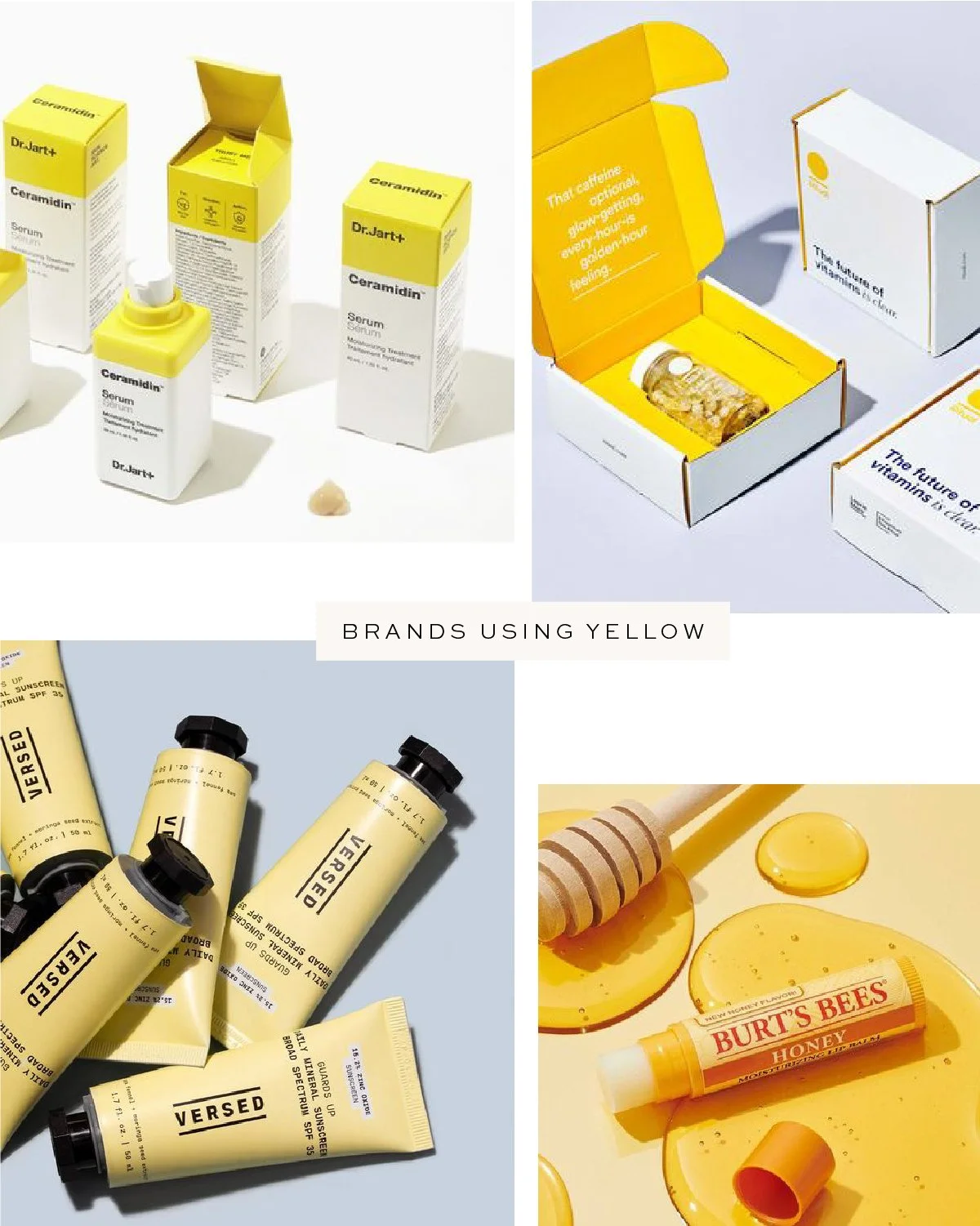
Yellow
Associated with happiness, joy, positivity, enthusiasm, and optimism. For legibility’s sake, it tends to be the secondary/background to brands’ color palettes, like the background in logos for Best Buy, Denny’s, Sonic, DHL, Post-it, Lipton, Nikon, Hertz, Burt’s Bees, or Snapchat.
It is a mood-lifter and gives a hopeful feeling to brand visuals. It also suggests the sun, which is why you’ll see it on lots of sunscreens.
Favorite pairings: pale pink, black, bright white

Pink
Communicates sweetness, admiration, and youth. Most people do associate softer pinks with femininity, and bright pinks give all the Barbie vibes. We see it used in a wide variety of industries with little pattern: think T-Mobile, Lyft, Baskin Robbins, Dunkin Donuts, Victoria’s Secret, or Taco Bell.
It’s also common in women-centered industries, like makeup, skincare, baby-related products, and desserts. Certain tones can go through the fad cycle—you may remember the early 2010s were filled with a pale pink dubbed “millennial pink.”
Favorite pairings:

Orange
Associated with feelings of adventure, creativity, energy, and confidence. The industries are wide here as well, seen from Etsy’s logo up to Hermes’s signature boxes, or in Home Depot, Reese’s, Amazon, and Nickelodeon. Brands with orange definitely want to make a statement and convey excitement.
Favorite pairings: light blue, taupe, teal
Do any of these colors seem like a good fit for your brand? If you need help bringing it all together, please contact us!