
Just My Type {Part One}: Serif and Sans Serif Type
When it comes to your brand, I can’t think of anything that could make or break it more than choosing the right typography. You letter shapes, spacing, and size have such an impact on brand personality, style, and legibility.
It might feel like designers just peruse a few fonts, apply them, and you’re set to go. While the process is extensive and content for another post, let’s take a look today at the history of our fonts and what they mean for your brand.
So, first…what is a serif?
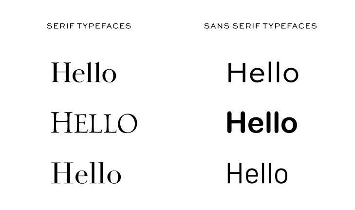
Let’s go to the start: a serif is a small line or stroke regularly attached to the end of a larger stroke in a letter or symbol.
A serif font is one whose letters use serifs. A sans serif font is one that does not have serifs on its letters.
A bit of type history
There is plenty of history to uncover for anyone who is a type nerd, but we’ll stick with the brief overview.
It is generally believed that serifs originated from the early Greek stone writings with inscriptional words carved into stone in Roman antiquity. Many think the Roman letter outlines were first painted onto stone, and the stone carvers followed the brush marks, which flared at stroke ends and corners, creating serifs. Another theory is that serifs were devised to neaten the ends of lines as they were chiselled into stone.
San serif letters have always been common in casual writing and in basic handwriting, but the first produced sans-serif printing type—an all caps type—arrived in England in the early 1800s from William Caslon IV.
Serif vs. Sans Serif in branding

Every font conveys a different feeling and personality. Serif typefaces are considered to be stable, responsible and dependable. They are often more elegant and refined, as you often see them in luxury brands in industries like hospitality, fashion, or jewelry. They convey a more classic and elevated look and a sense of authority. In fiction, you can see the logo of the hotel on HBO’s The White Lotus or The West Wing used serif fonts to convey authority and class.
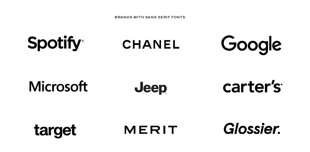
Sans serif typefaces tend to be more contemporary, relatable, and easygoing. They often employ a sense of minimalism, and their lack of ornamental features can convey honesty and sensibility. This can make them feel more friendly or comforting. You see them often in industries like tech, children’s products, or wide-appealing brands like a big box store, as these types of brands want to feel transparent and approachable. In higher-end brands, the use of sans serif may be used to convey that they are more contemporary or innovative than their counterparts.
In terms of legibility, there is lots of research and opinions, but in general, serif fonts are easier to read in print, and sans serif fonts are easier to read on screens.
Now, there are many other further classifications within serif and sans serif families, but this should give you a solid high-level view of the personality differences.
What this means for you
Your first step is to do a deep dive into your own goals.
What sets your brand apart?
What sort of message do you want your brand to convey to your audience?
What will make the best connection with your customers or clients?
Having the answers to these questions are a key first step in choosing the path for your brand fonts. For example, if you want to feel elevated, classic, and trustworthy, then a serif may be the right choice. If you want to feel approachable, friendly, and contemporary, then a sans serif may do the trick.
Stay tuned for part two in our type series!