
Current favorite Google font pairings

One of the most important (and sometimes daunting) decisions about your website is selecting the most appropriate typography. You want it to feel unique, be part of your brand personality, and easy on your reader's eyes. It is a key component of your visual brand, after all.
Google Fonts are wonderful because they are well-designed and since it is open source, free to use on your website. My top tips when making your selections:
Don't choose more than 2-3 for your site. Consistency rules all, and any more than that will start to make your readers' eyes cross.
Make sure everything is legible. Messy, scripty, or funky fonts (like this or this) might be fun for a single word in a graphic here or there, but it will make your site hard to read and your reader clicking away quickly. And, definitely don't use any script fonts for body copy.
Strive for contrast. Try pairing one heavier font with a lighter one, and a serif with a sans serif. You can filter these options on the sidebar of Google fonts as you search to make it easier.
Make sure the font you choose has the styles you need. Some fonts don't come in italic or don't have many weights. If it's for a headline, you may not need italic, but if it's for your body copy, you'll probably want to have that option.
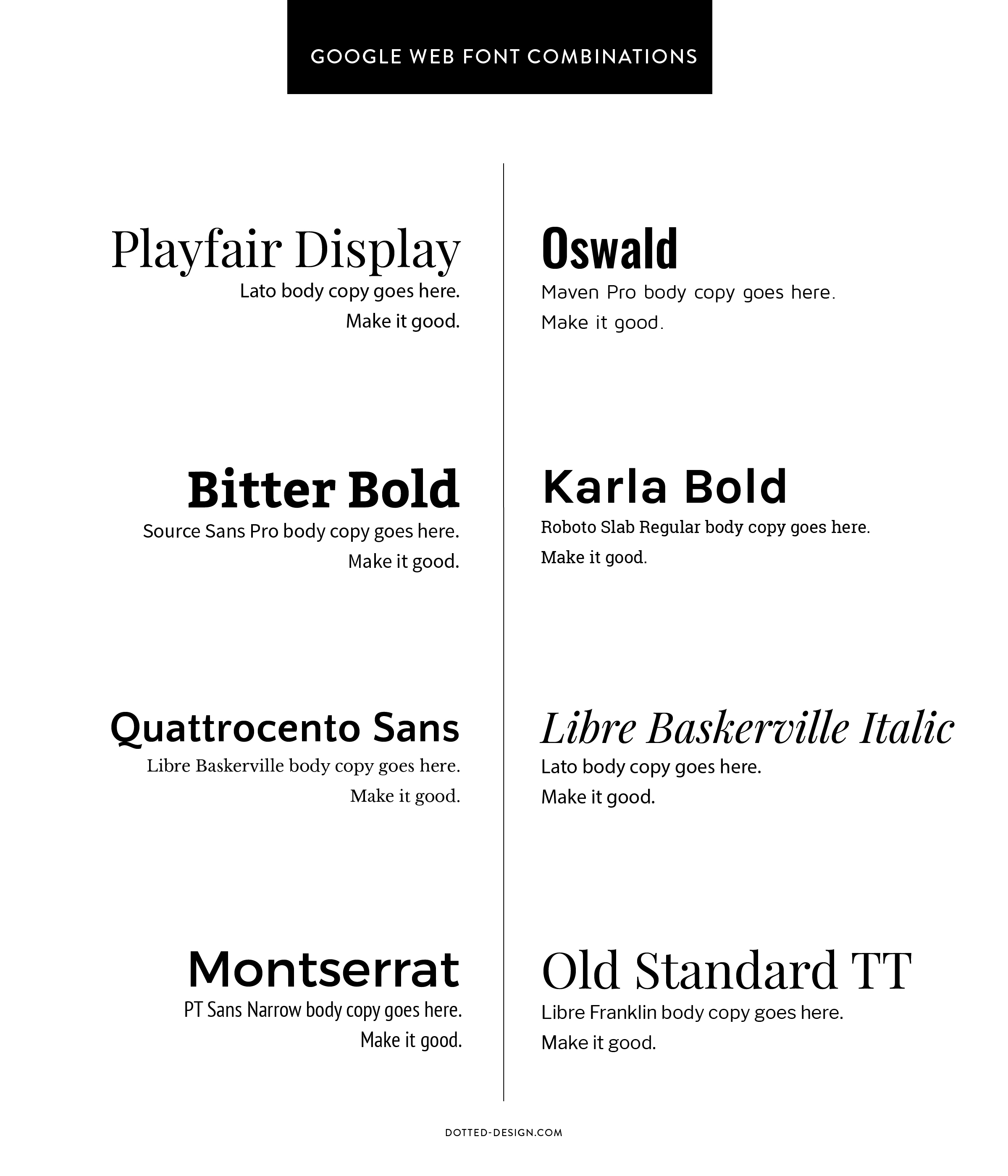
Without further ado, here are some of my current favorite combinations from the Google Font options:
google font combinations
Playfair Display with Lato • Oswald with Maven Pro
Bitter Bold with Source Sans Pro • Karla Bold with Roboto Slab
Quattrocento Sans with Libre Baskerville • Libre Baskerville Italic with Lato
Montserrat with PT Sans Narrow • Old Standard TT with Libre Franklin
What are you favorite fonts to pair online?